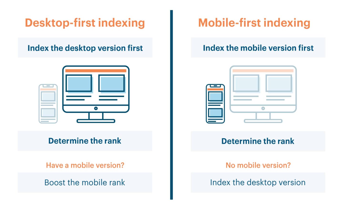
Starting in July 2018, Google will implement mobile-first indexing, which means that websites will be ranked in Google’s index based on their mobile versions. The company’s official blog explained: “We’ll use the mobile version of the content for indexing and ranking, to better help our – primarily mobile – users find what they’re looking for”. Desktop websites will still be considered the primary version until July.
The following tips will help you prepare for this important change.
What if I Don’t Have a Mobile Version?
This new approach to indexing is called “mobile-first”, not “mobile-only”. So, if you don’t have a mobile version of your website, Google will continue to index the desktop version. However, this means that you may not rank as highly as your mobile-friendly competitors. According to Google officials, it would be better to have a functional desktop version for ranking than provide a broken or incomplete mobile version. Remember, a single index will be used to serve search results (there are no separate indexes for desktop and mobile versions).
What Should I Do About Google`s Mobile-First Indexing?
You may not require a massive upgrade if your website is already responsive or your mobile and desktop versions are equivalent in terms of performance in search results. According to Google, websites that “make use of responsive web design and correctly implement dynamic serving (that include all of the desktop content and markup) generally don’t have to do anything”. Thus, while responsive and fast-loading websites will have higher search rankings, the lack of a mobile-friendly experience may negatively impact a website’s ranking. Ensure your website is ready for this important shift in indexing by following the tips below.
Tip 1. Use Special Tools to Determine How Many Upgrades You Need to Make
Choose any of the following tools or check all of them to audit your website.
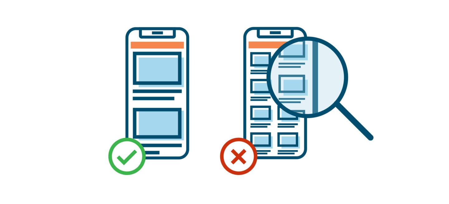
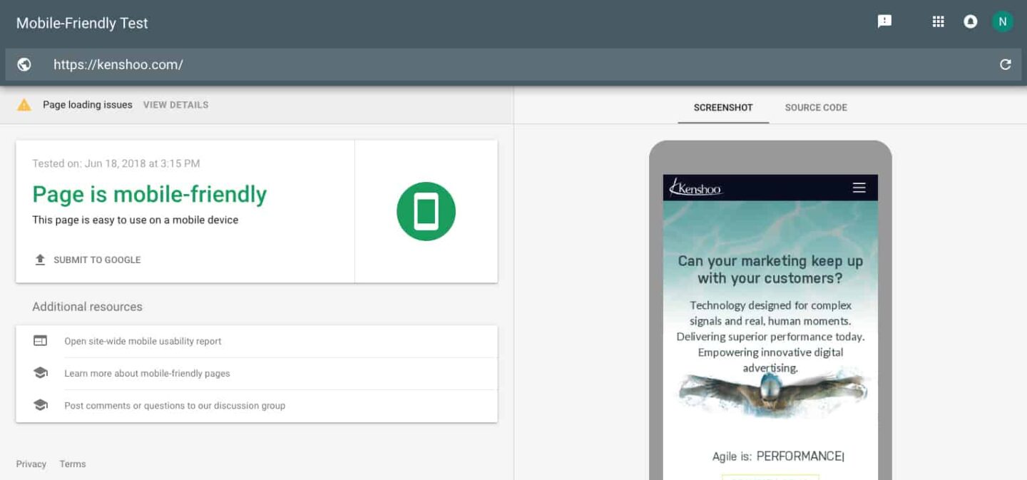
1. Use Google’s Mobile-Friendly Test to check whether your website is mobile-friendly. Simply type in the URL of the website. As a result, get a screenshot of how your website looks to Google on mobile devices, a list of identified problems, and improvement tips. Small font sizes or the use of Flash are potential mobile usability problems.
2. Profile your mobile performance with Google’s Lighthouse, which can provide audits for performance, accessibility, and more. It will give you a report that includes tips for speed improvement. Run Lighthouse in the Audits panel of Chrome DevTools or as a Chrome Extension.
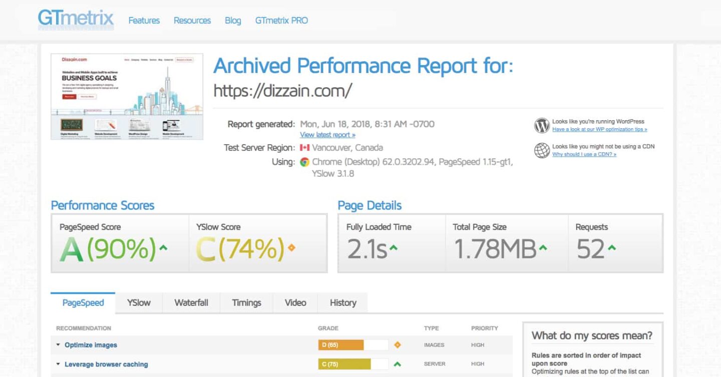
3. Analyze your website’s speed with GTmetrix, which checks page loading and gives recommendations on how to make it faster. According to Google research (September 2016), 53% of mobile users abandon a mobile website that takes more than 3 seconds to load.
4. Try PageSpeed Insights, a tool that indicates how well a page performs on the Chrome UX Report and suggests performance optimizations.
Tip 2. Make Your Website Responsive and User-Friendly
1. High-quality content is crucial. Make sure text, images with alt attributes, and videos have crawlable and indexable formats. Consider the details: ensure readable font sizes, clickable visual and touch targets, tappable phone numbers, and more.
2. Remember that mobile platforms impose a lot of limitations on content. You should care about optimization: don’t upload heavy visual content and avoid big graphics for mobile users.
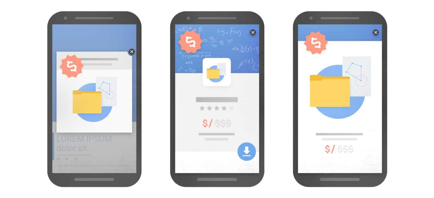
3. Refuse certain types of pop-ups and Flash for mobile. Today, Google penalizes websites for making content less accessible. For example, showing a popup that covers the main information can be annoying. Furthermore, Flash isn’t supported by some devices.
4. Enable structured data. This helps Google index your website and better understand the context for display in search results. The Structured Data Testing Tool can help you test your markup.
5. Make use of Accelerated Mobile Pages (AMP) to increase page load speed. This framework allows websites to have lightweight web pages and improves the performance of mobile users. For websites with both AMP and non-AMP pages, Google will prefer to index the mobile version of the non-AMP page.
6. Adapt metadata and social metadata for mobile users. Remember that titles and descriptions should be shorter for mobile devices, but equivalent across both mobile and desktop versions (if you have separate versions).
Tip 3. For Separate Mobile and Desktop Versions, Follow Google’s Tips
1. Serve structured markup for both the desktop and mobile versions. Ensure URLs within the structured data are updated to the mobile version on mobile pages.
2. Make sure that metadata is present on both versions of the website, and that your titles and meta descriptions are equivalent across both versions as well.
3. Verify that your mobile version is accessible to Googlebot with the robots.txt testing tool.
4. If your mobile version is on a separate host, ensure that the servers have enough capacity to handle a potentially increased crawl rate.
5. Do you only have a desktop version verified in Search Console? Add and verify a mobile version.
Also, you can explore Google`s developer documentation on best practices for mobile-first indexing. It covers how websites using responsive web design or dynamic serving are generally set for mobile-first indexing.
Conclusion
First, start by testing your mobile website to determine whether Google likes it. Next, decide what kind of upgrades you need. Finally, don’t hesitate to contact us for help.