New logo for the New York World

In this post I will give you an in-depth look at how we approach designing a logo through a demonstration of the process we followed while creating an identity and a website for The New York World, an investigative reporting publication produced by the Columbia University School of Journalism.
Background
The New York World (NYW) takes it’s name from a groundbreaking newspaper published by the school’s founder Joseph Pultzer. The NYW of our age carries the tradition of investigative journalism with an emphasis on data-driven approach to newsmaking – they create stories with the help of innovative data analysis techniques in collaboration with other news agencies to illuminate the issues affecting New York boroughs.
Problem
The original logo was outdated and no longer reflected the vision of the organization. In order to complete ongoing rebranding, the organization required a new logo and a new website to demonstrate their focus on hard data and New York focus.
Solution
Through a detailed conversation with the client we were able to understand their vision and could proceed with the design prototyping. It was clear that the new logo should pay respect to the history, but also indicate the focus on data. We chose red and black as dominant colors and then started creating rough sketches to collect a large array of ideas from our designers.
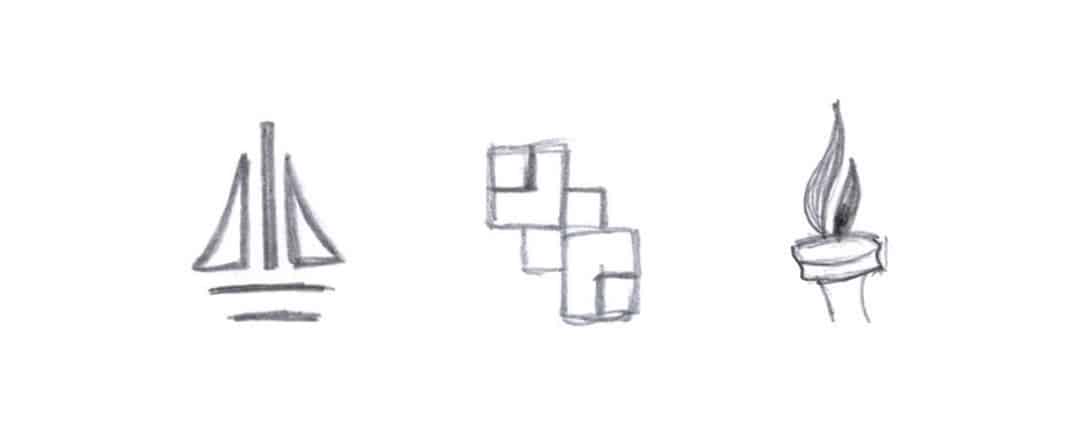

The bold and thick fonts were meant to resemble newspaper headlines; the visual elements of the logo drew parallels with data visualization. Also we included the reference to New York City while avoiding the most obvious visual choices. After conducting a limited user research sessions we picked a few seeming winners to develop into full design concepts and share with the client:
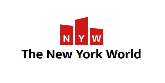
Three red blocks symbolize New York skyline.
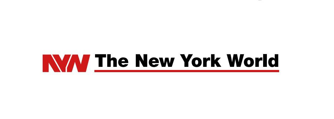
The font in this option looked very close to that of the headlines
of the original historic newspaper from the 1800s.
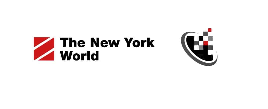
Diagonal white lines on a red box were inspired by the reflection from glistening walls of the city buildings.
A figure on the right stands for data.
We played with the font on the NYW.

Another version of the New York City skyline coupled with “data” colored bars.
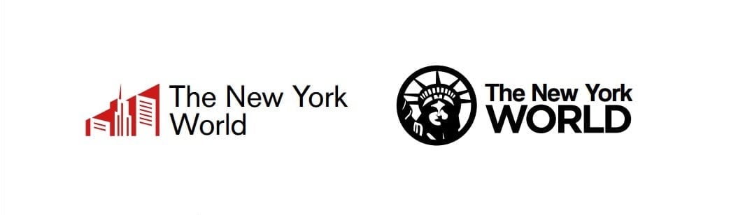
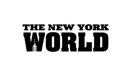
The more prominent city view and the Statue of Liberty.
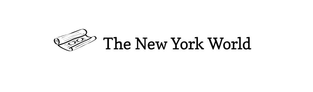
Somewhat of an antique take on the logo.
After reviewing all concepts with the client we jointly came to the conclusion that data-driven journalism is far more important than a New York focus and should be prominent in the logo.
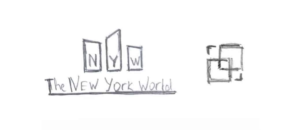
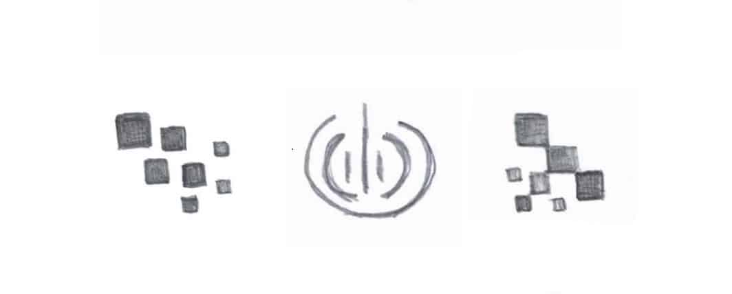
We went back to the drawing board and created a few additional concepts:


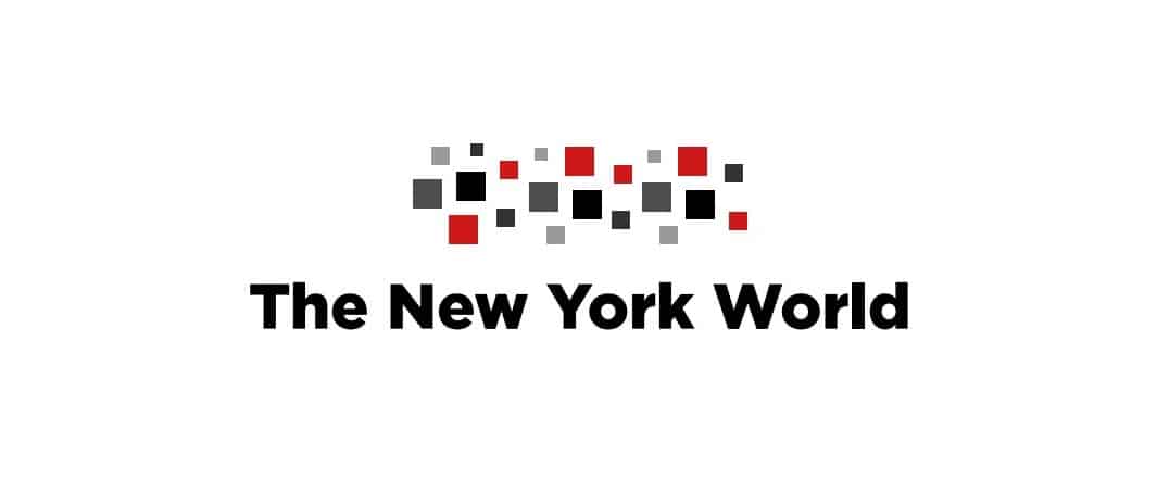
Outcome.
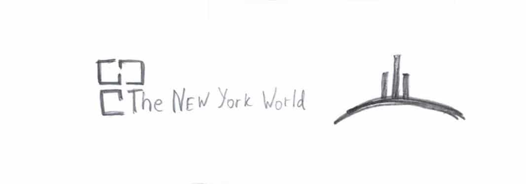
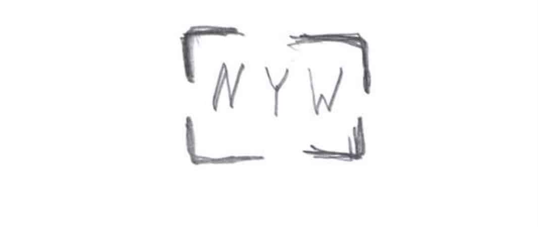
After 3 rounds of reviews we were able to pick the winner. The logo that was chosen resembles a camera viewfinder with NY in focus. It was among the initial sketches, but was first discounted and not demonstrated to the client. A simple and yet powerful logo that met all the requirements of the client. The logo was completed and became a part of the new NYW identity and the integral part of the website that we built.